The tidyverse is a series of packages developed by Hadley Wickham and his team at RStudio. https://www.tidyverse.org/
I teach/use the tidyverse for 3 major reasons:
Simple functions that do one thing well
Consistent implementations across functions within tidyverse (i.e. common APIs)
Provides a framework for data manipulation
Course Setup
install.packages("tidyverse")
library(tidyverse)
Explore Data
plot of chunk data
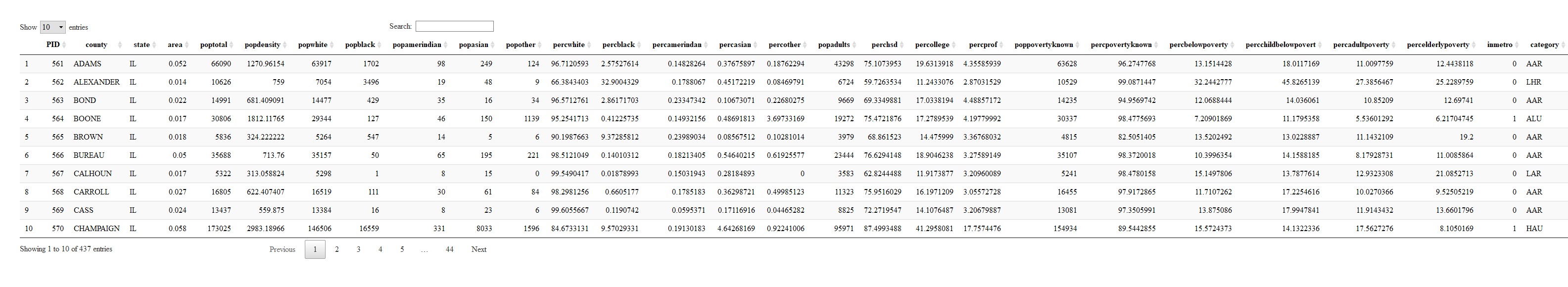
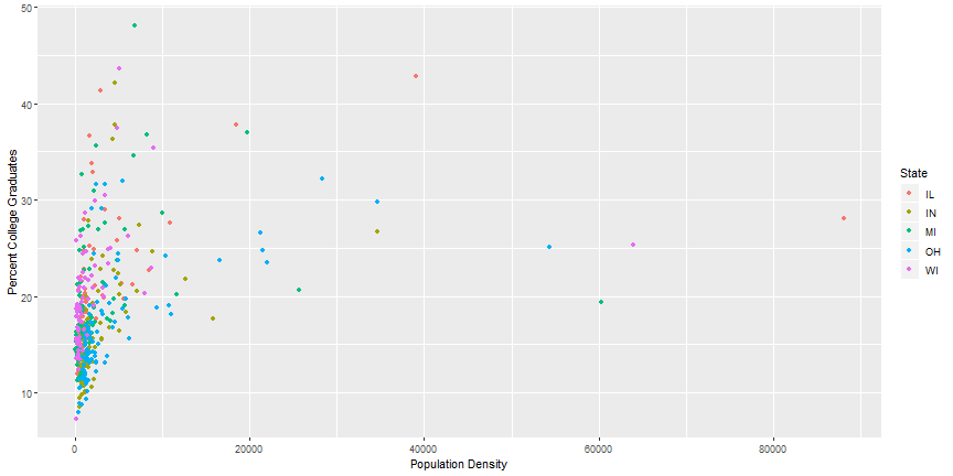
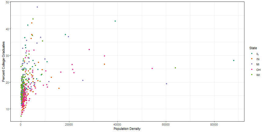
First ggplot
ggplot(data = midwest) +geom_point(mapping =aes(x = popdensity, y = percollege))
plot of chunk plot1
Equivalent Code
ggplot(midwest) +geom_point(aes(x = popdensity, y = percollege))
plot of chunk plot1_reduced
Your Turn
Try plotting popdensity by state.
Try plotting county by state.
Does this plot work?
Bonus: Try just using the ggplot(data = midwest) from above.
What do you get?
Does this make sense?
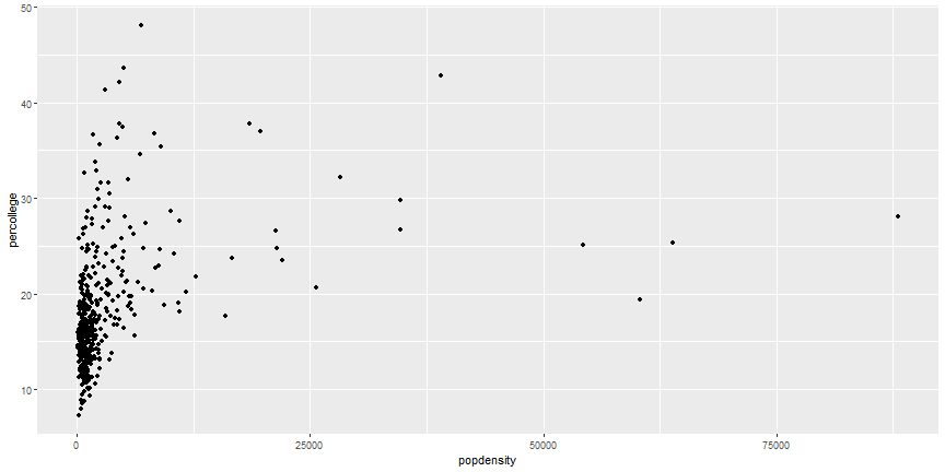
Add Aesthetics
ggplot(midwest) +geom_point(aes(x = popdensity, y = percollege, color = state))
plot of chunk aesthetic
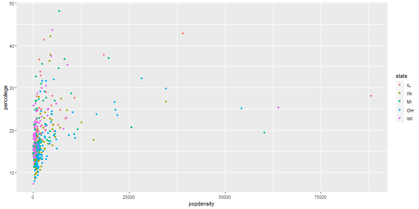
Global Aesthetics
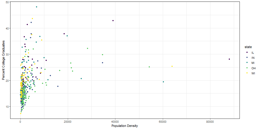
ggplot(midwest) +geom_point(aes(x = popdensity, y = percollege), color ='pink')
plot of chunk global_aes
Your Turn
Instead of using colors, make the shape of the points different for each state.
Instead of color, use alpha instead.
What does this do to the plot?
Try the following command: colors().
Try a few colors to find your favorite.
What happens if you use the following code:
ggplot(midwest) +geom_point(aes(x = popdensity, y = percollege, color ='green'))
Additional Geoms
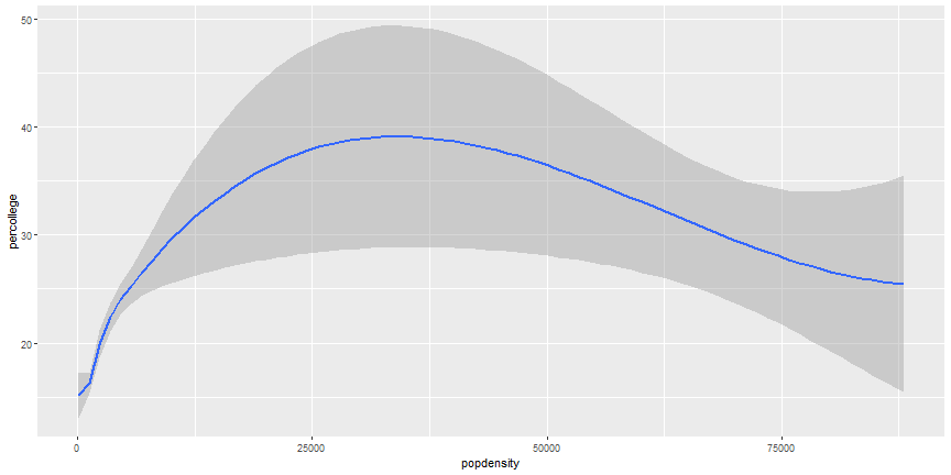
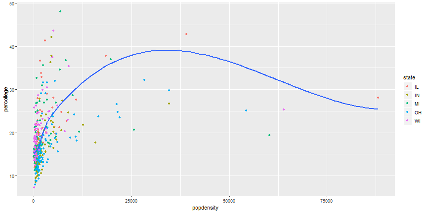
ggplot(midwest) +geom_smooth(aes(x = popdensity, y = percollege))
plot of chunk smooth
Add more Aesthetics
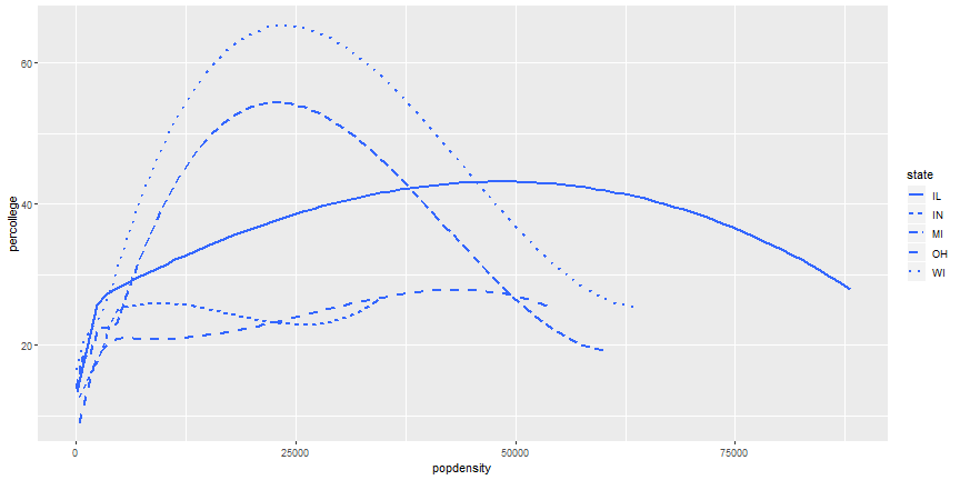
ggplot(midwest) +geom_smooth(aes(x = popdensity, y = percollege, linetype = state), se =FALSE)
plot of chunk smooth_states
Your Turn
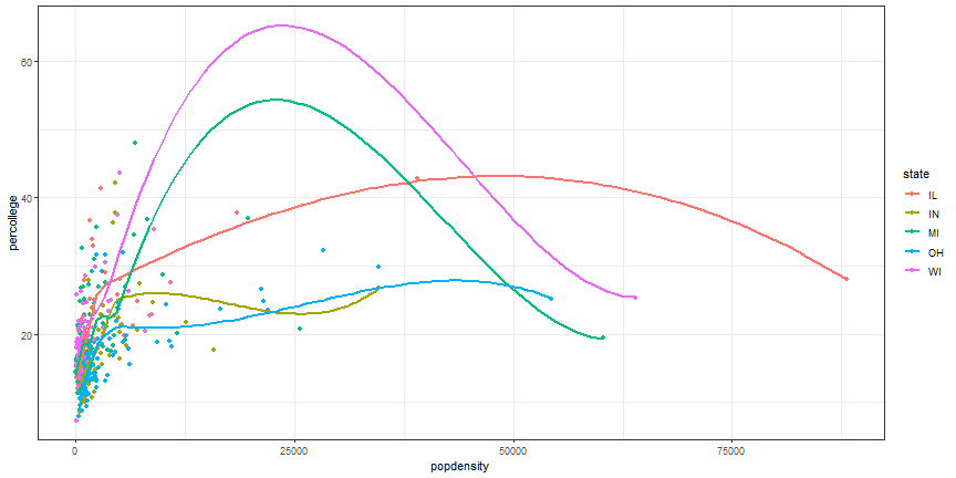
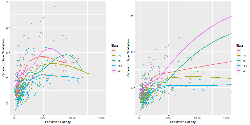
It is possible to combine geoms, which we will do next, but try it first. Try to recreate this plot.
Layered ggplot
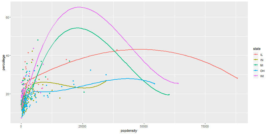
ggplot(midwest) +geom_point(aes(x = popdensity, y = percollege, color = state)) +geom_smooth(aes(x = popdensity, y = percollege, color = state), se =FALSE)
plot of chunk combine_geoms
Remove duplicate aesthetics
ggplot(midwest, aes(x = popdensity, y = percollege, color = state)) +geom_point() +geom_smooth(se =FALSE)
plot of chunk two_geoms
Your Turn
Can you recreate the following figure?
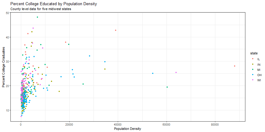
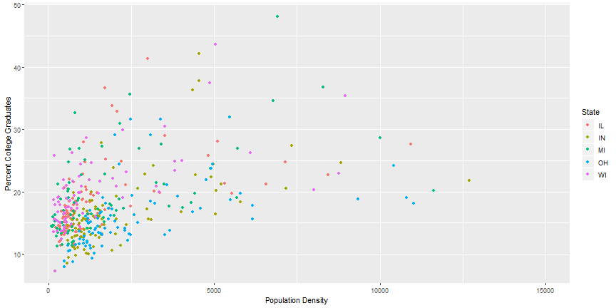
Brief plot customization
ggplot(midwest, aes(x = popdensity, y = percollege, color = state)) +geom_point() +scale_x_continuous("Population Density", breaks =seq(0, 80000, 20000)) +scale_y_continuous("Percent College Graduates") +scale_color_discrete("State")
Brief plot customization Output
plot of chunk breaks_x2
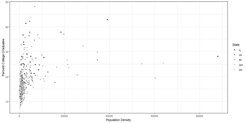
Change plot theme
ggplot(midwest, aes(x = popdensity, y = percollege, color = state)) +geom_point() +geom_smooth(se =FALSE) +theme_bw()
## Parsed with column specification:
## cols(
##   Film = col_character(),
##   Chapter = col_character(),
##   Character = col_character(),
##   Race = col_character(),
##   Words = col_integer()
## )
head(lotr)
## # A tibble: 6 x 5
##   Film                       Chapter                Character Race   Words
##   <chr>                      <chr>                  <chr>     <chr>  <int>
## 1 The Fellowship Of The Ring 01: Prologue           Bilbo     Hobbit     4
## 2 The Fellowship Of The Ring 01: Prologue           Elrond    Elf        5
## 3 The Fellowship Of The Ring 01: Prologue           Galadriel Elf      460
## 4 The Fellowship Of The Ring 02: Concerning Hobbits Bilbo     Hobbit   214
## 5 The Fellowship Of The Ring 03: The Shire          Bilbo     Hobbit    70
## 6 The Fellowship Of The Ring 03: The Shire          Frodo     Hobbit   128
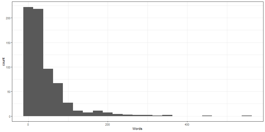
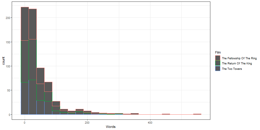
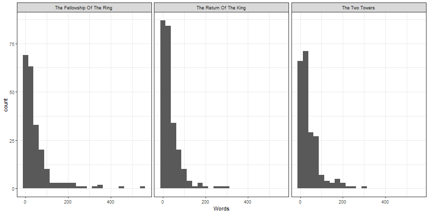
With more than two groups, histograms are difficult to interpret due to overlap. Instead, use the geom_density to create a density plot for Words for each film.
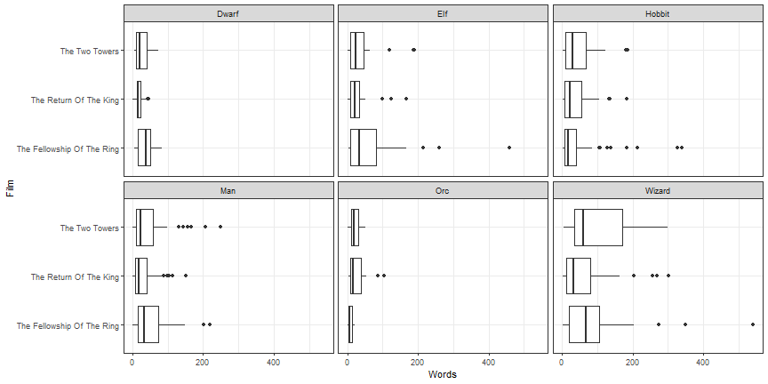
Using geom_boxplot, create boxplots with Words as the y variable and Film as the x variable. Bonus: facet this plot by the variable Race. Bonus2: Zoom in on the bulk of the data.
## Parsed with column specification:
## cols(
##   Film = col_character(),
##   Chapter = col_character(),
##   Character = col_character(),
##   Race = col_character(),
##   Words = col_integer()
## )
lotr
## # A tibble: 682 x 5
##    Film                       Chapter                Character Race  Words
##    <chr>                      <chr>                  <chr>     <chr> <int>
##  1 The Fellowship Of The Ring 01: Prologue           Bilbo     Hobb~     4
##  2 The Fellowship Of The Ring 01: Prologue           Elrond    Elf       5
##  3 The Fellowship Of The Ring 01: Prologue           Galadriel Elf     460
##  4 The Fellowship Of The Ring 02: Concerning Hobbits Bilbo     Hobb~   214
##  5 The Fellowship Of The Ring 03: The Shire          Bilbo     Hobb~    70
##  6 The Fellowship Of The Ring 03: The Shire          Frodo     Hobb~   128
##  7 The Fellowship Of The Ring 03: The Shire          Gandalf   Wiza~   197
##  8 The Fellowship Of The Ring 03: The Shire          Hobbit K~ Hobb~    10
##  9 The Fellowship Of The Ring 03: The Shire          Hobbits   Hobb~    12
## 10 The Fellowship Of The Ring 04: Very Old Friends   Bilbo     Hobb~   339
## # ... with 672 more rows
Create plotly by hand
plot_ly(lotr, x =~Words) %>%add_histogram() %>%print()
Subplots
one_plot <-function(d) {plot_ly(d, x =~Words) %>%add_histogram() %>%add_annotations(~unique(Film), x =0.5, y =1, xref ="paper", yref ="paper", showarrow =FALSE )}lotr %>%split(.$Film) %>%lapply(one_plot) %>%subplot(nrows =1, shareX =TRUE, titleX =FALSE) %>%hide_legend() %>%print()
Grouped bar plot
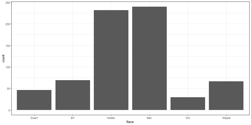
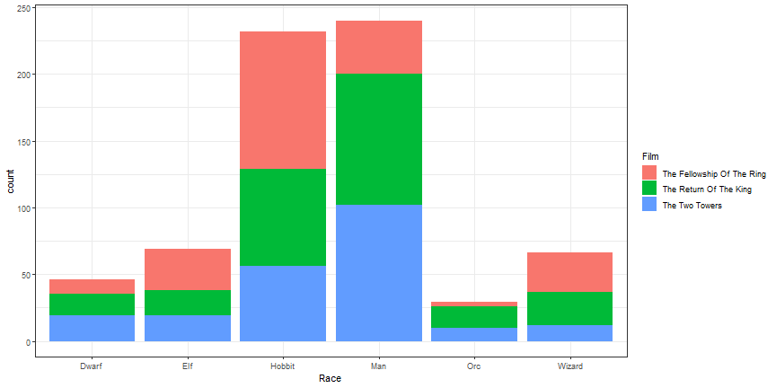
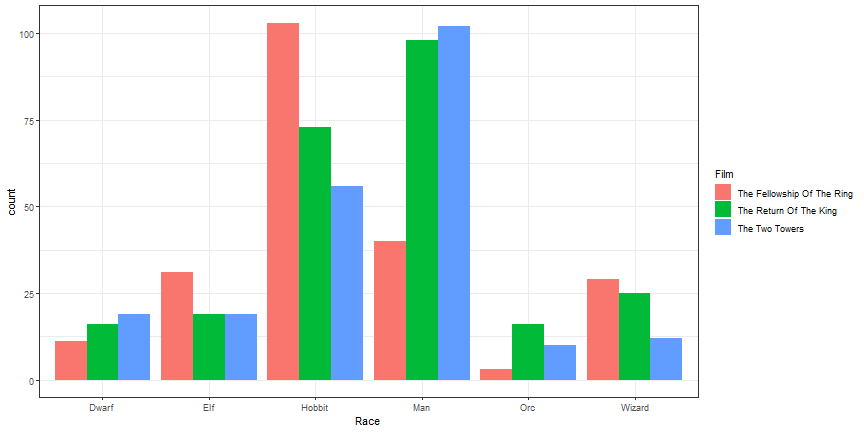
plot_ly(lotr, x =~Race, color =~Film) %>%add_histogram() %>%print()
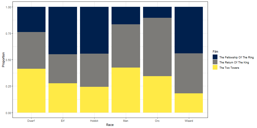
Plot of proportions
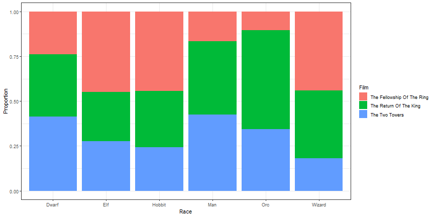
# number of diamonds by cut and clarity (n)lotr_count <-count(lotr, Race, Film)# number of diamonds by cut (nn)lotr_prop <-left_join(lotr_count, count(lotr_count, Race, wt = n))lotr_prop %>%mutate(prop = n / nn) %>%plot_ly(x =~Race, y =~prop, color =~Film) %>%add_bars() %>%layout(barmode ="stack") %>%print()
Your Turn
Using the gss_cat data, create a histrogram for the tvhours variable.
Using the gss_cat data, create a bar chart showing the partyid variable by the marital status.
Scatterplots by Hand
plot_ly(midwest, x =~popdensity, y =~percollege) %>%add_markers() %>%print()
Change symbol
plot_ly(midwest, x =~popdensity, y =~percollege) %>%add_markers(symbol =~state) %>%print()
Change color
plot_ly(midwest, x =~popdensity, y =~percollege) %>%add_markers(color =~state, colors = viridis::viridis(5)) %>%print()
Line Graph
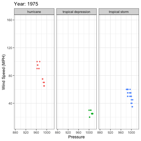
storms_yearly <- storms %>%group_by(year) %>%summarise(num =length(unique(name)))plot_ly(storms_yearly, x =~year, y =~num) %>%add_lines() %>%print()
Your Turn
Using the gss_cat data, create a scatterplot showing the age and tvhours variables.
Compute the average time spent watching tv by year and marital status. Then, plot the average time spent watching tv by year and marital status.
Highcharter; Highcharts for R
devtools::install_github("jbkunst/highcharter")
hchart function
library(highcharter)lotr_count <- lotr %>%count(Film, Race)hchart(lotr_count, "column", hcaes(x = Race, y = n, group = Film)) %>%print()
A second hchart
hchart(midwest, "scatter", hcaes(x = popdensity, y = percollege, group = state)) %>%print()
Histogram
hchart(lotr$Words) %>%print()
Your Turn
Using the hchart function, create a bar chart or histogram with the gss_cat data.
Using the hchart function, create a scatterplot with the gss_cat data.
Build Highcharts from scratch
hc <-highchart() %>%hc_xAxis(categories = lotr_count$Race) %>%hc_add_series(name ='The Fellowship Of The Ring', data =filter(lotr_count, Film =='The Fellowship Of The Ring')$n) %>%hc_add_series(name ='The Two Towers', data =filter(lotr_count, Film =='The Two Towers')$n) %>%hc_add_series(name ='The Return Of The King', data =filter(lotr_count, Film =='The Return Of The King')$n)hc %>%print()
Change Chart type
hc <- hc %>%hc_chart(type ='column')hc %>%print()
Change Colors
hc <- hc %>%hc_colors(substr(viridis(3), 0, 7))hc %>%print()
Modify Axes
hc <- hc %>%hc_xAxis(title =list(text ="Race")) %>%hc_yAxis(title =list(text ="Number of Words Spoken"),showLastLabel =FALSE)hc %>%print()
Add title, subtitle, move legend
hc <- hc %>%hc_title(text ='Number of Words Spoken in Lord of the Rings Films',align ='left') %>%hc_subtitle(text ='Broken down by <i>Film</i> and <b>Race</b>', align ='left') %>%hc_legend(align ='right', verticalAlign ='top', layout ='vertical',x =0, y =80) %>%hc_exporting(enabled =TRUE)hc %>%print()
Your Turn
Build up a plot from scratch, getting the figure close to publication quality using the gss_cat data.