<h1>Data Visualization - Static and Interactive Graphics using R</h1>
<h2>Brandon LeBeau</h2>
<h3>University of Iowa</h3>
# About Me
- I'm an Assistant Professor in the College of Education
+ I enjoy model building, particularly longitudinal models, and statistical programming.
- I've used R for over 10 years.
+ I have 4 R packages, 3 on CRAN, 1 on GitHub
* simglm
* pdfsearch
* highlightHTML
* SPSStoR
- GitHub Repository for this workshop: <https://github.com/lebebr01/iowa_data_science>
# Why teach the tidyverse
- The tidyverse is a series of packages developed by Hadley Wickham and his team at RStudio. <https://www.tidyverse.org/>
- I teach/use the tidyverse for 3 major reasons:
+ Simple functions that do one thing well
+ Consistent implementations across functions within tidyverse (i.e. common APIs)
+ Provides a framework for data manipulation
# Course Setup
```r
install.packages("tidyverse")
```
```r
library(tidyverse)
```
# Explore Data
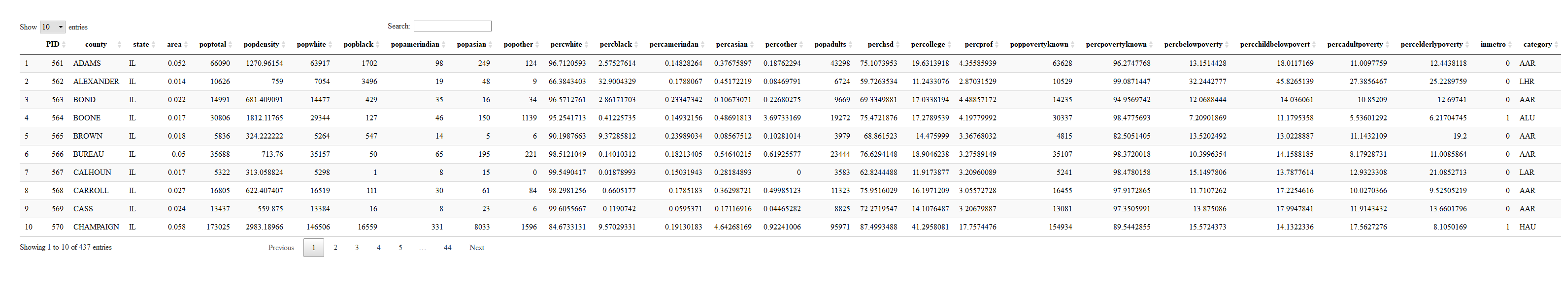
# First ggplot
```r
ggplot(data = midwest) +
geom_point(mapping = aes(x = popdensity, y = percollege))
```
# Equivalent Code
```r
ggplot(midwest) +
geom_point(aes(x = popdensity, y = percollege))
```

# Your Turn
1. Try plotting `popdensity` by `state`.
2. Try plotting `county` by `state`.
+ Does this plot work?
3. Bonus: Try just using the `ggplot(data = midwest)` from above.
+ What do you get?
+ Does this make sense?
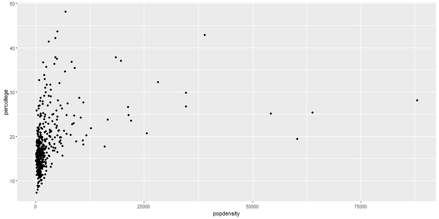
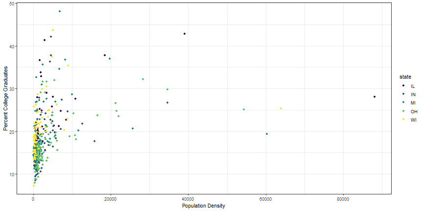
# Add Aesthetics
```r
ggplot(midwest) +
geom_point(aes(x = popdensity, y = percollege, color = state))
```
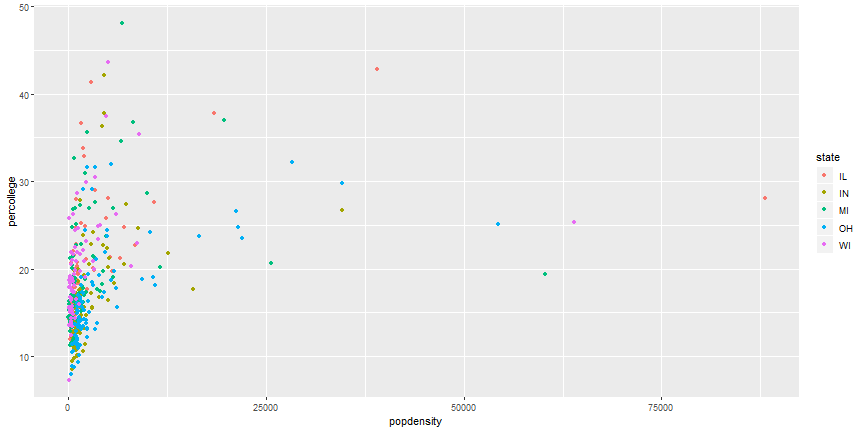
# Global Aesthetics
```r
ggplot(midwest) +
geom_point(aes(x = popdensity, y = percollege), color = 'pink')
```
# Your Turn
1. Instead of using colors, make the shape of the points different for each state.
2. Instead of color, use `alpha` instead.
+ What does this do to the plot?
3. Try the following command: `colors()`.
+ Try a few colors to find your favorite.
4. What happens if you use the following code:
```r
ggplot(midwest) +
geom_point(aes(x = popdensity, y = percollege, color = 'green'))
```
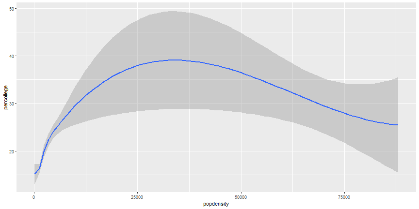
# Additional Geoms
```r
ggplot(midwest) +
geom_smooth(aes(x = popdensity, y = percollege))
```
# Add more Aesthetics
```r
ggplot(midwest) +
geom_smooth(aes(x = popdensity, y = percollege, linetype = state),
se = FALSE)
```
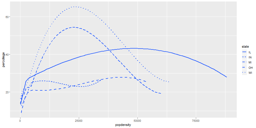
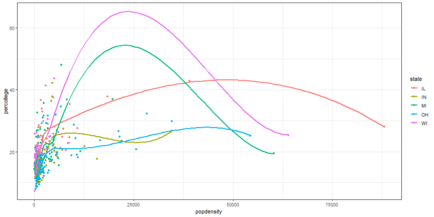
# Your Turn
1. It is possible to combine geoms, which we will do next, but try it first. Try to recreate this plot.

# Layered ggplot
```r
ggplot(midwest) +
geom_point(aes(x = popdensity, y = percollege, color = state)) +
geom_smooth(aes(x = popdensity, y = percollege, color = state),
se = FALSE)
```

# Remove duplicate aesthetics
```r
ggplot(midwest,
aes(x = popdensity, y = percollege, color = state)) +
geom_point() +
geom_smooth(se = FALSE)
```
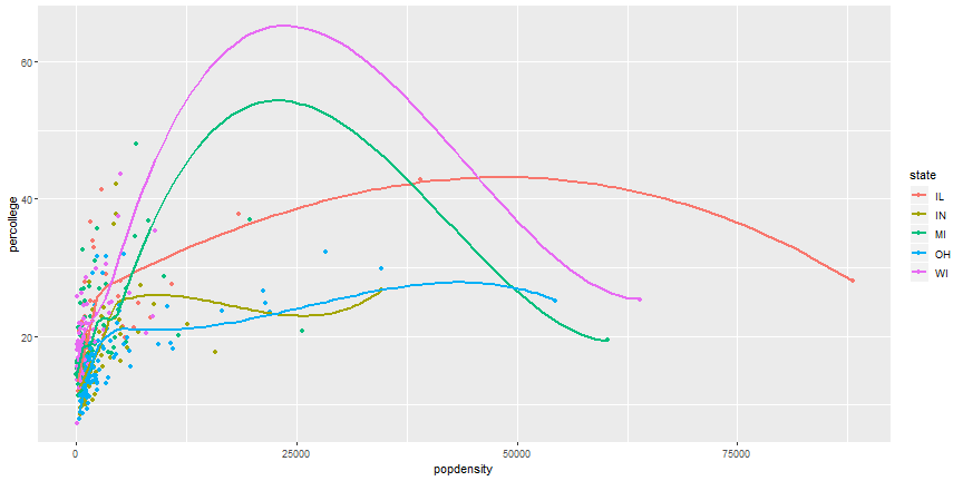
# Your Turn
1. Can you recreate the following figure?
# Brief plot customization
```r
ggplot(midwest,
aes(x = popdensity, y = percollege, color = state)) +
geom_point() +
scale_x_continuous("Population Density",
breaks = seq(0, 80000, 20000)) +
scale_y_continuous("Percent College Graduates") +
scale_color_discrete("State")
```
# Brief plot customization Output

# Change plot theme
```r
ggplot(midwest,
aes(x = popdensity, y = percollege, color = state)) +
geom_point() +
geom_smooth(se = FALSE) +
theme_bw()
```
# More themes
+ Themes in ggplot2: <http://ggplot2.tidyverse.org/reference/ggtheme.html>
+ Themes from ggthemes package: <https://cran.r-project.org/web/packages/ggthemes/vignettes/ggthemes.html>
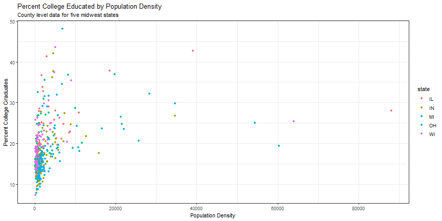
# Base plot for reference
```r
p1 <- ggplot(midwest,
aes(x = popdensity, y = percollege, color = state)) +
geom_point() +
scale_x_continuous("Population Density",
breaks = seq(0, 80000, 20000)) +
scale_y_continuous("Percent College Graduates") +
theme_bw()
```
# Add plot title or subtitle
```r
p1 +
labs(title = "Percent College Educated by Population Density",
subtitle = "County level data for five midwest states")
```
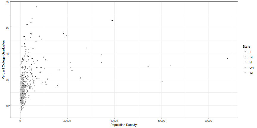
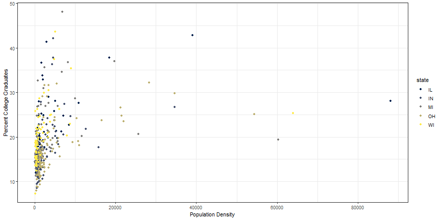
# Color Options
```r
p1 + scale_color_grey("State")
```
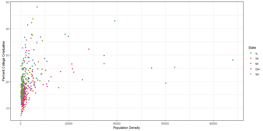
# Using colorbrewer2.org
+ <http://colorbrewer2.org>
```r
p1 + scale_color_brewer("State", palette = 'Dark2')
```
# Two additional color options
+ viridis: <https://github.com/sjmgarnier/viridis>
+ scico: <https://github.com/thomasp85/scico>
# viridis colors
```r
library(viridis)
p1 + scale_color_viridis(discrete = TRUE)
```
# viridis colors
```r
p1 + scale_color_viridis(option = 'cividis', discrete = TRUE)
```
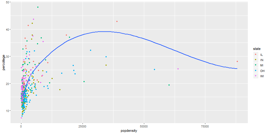
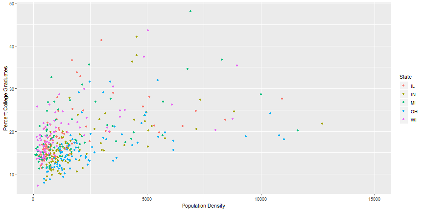
# Zoom in on a plot
```r
ggplot(data = midwest,
aes(x = popdensity, y = percollege, color = state)) +
geom_point() +
scale_x_continuous("Population Density") +
scale_y_continuous("Percent College Graduates") +
scale_color_discrete("State") +
coord_cartesian(xlim = c(0, 15000))
```
# Zoom in on a plot output
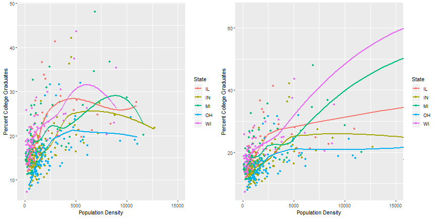
# Zoom using `scale_x_continuous` - Bad Practice
```r
ggplot(data = midwest,
aes(x = popdensity, y = percollege, color = state)) +
geom_point() +
geom_smooth(se = FALSE) +
scale_x_continuous("Population Density", limits = c(0, 15000)) +
scale_y_continuous("Percent College Graduates") +
scale_color_discrete("State")
```
# Comparing output
```
## `geom_smooth()` using method = 'loess' and formula 'y ~ x'
```
```
## Warning: Removed 16 rows containing non-finite values (stat_smooth).
```
```
## Warning: Removed 16 rows containing missing values (geom_point).
```
```
## `geom_smooth()` using method = 'loess' and formula 'y ~ x'
```
# Lord of the Rings Data
- Data from Jenny Bryan: <https://github.com/jennybc/lotr>
```r
lotr <- read_tsv('https://raw.githubusercontent.com/jennybc/lotr/master/lotr_clean.tsv')
```
```
## Parsed with column specification:
## cols(
## Film = col_character(),
## Chapter = col_character(),
## Character = col_character(),
## Race = col_character(),
## Words = col_integer()
## )
```
```r
head(lotr)
```
```
## # A tibble: 6 x 5
## Film Chapter Character Race Words
## <chr> <chr> <chr> <chr> <int>
## 1 The Fellowship Of The Ring 01: Prologue Bilbo Hobbit 4
## 2 The Fellowship Of The Ring 01: Prologue Elrond Elf 5
## 3 The Fellowship Of The Ring 01: Prologue Galadriel Elf 460
## 4 The Fellowship Of The Ring 02: Concerning Hobbits Bilbo Hobbit 214
## 5 The Fellowship Of The Ring 03: The Shire Bilbo Hobbit 70
## 6 The Fellowship Of The Ring 03: The Shire Frodo Hobbit 128
```
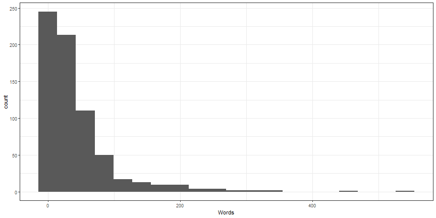
# Geoms for single variables
```r
ggplot(lotr, aes(x = Words)) +
geom_histogram() +
theme_bw()
```
```
## `stat_bin()` using `bins = 30`. Pick better value with `binwidth`.
```

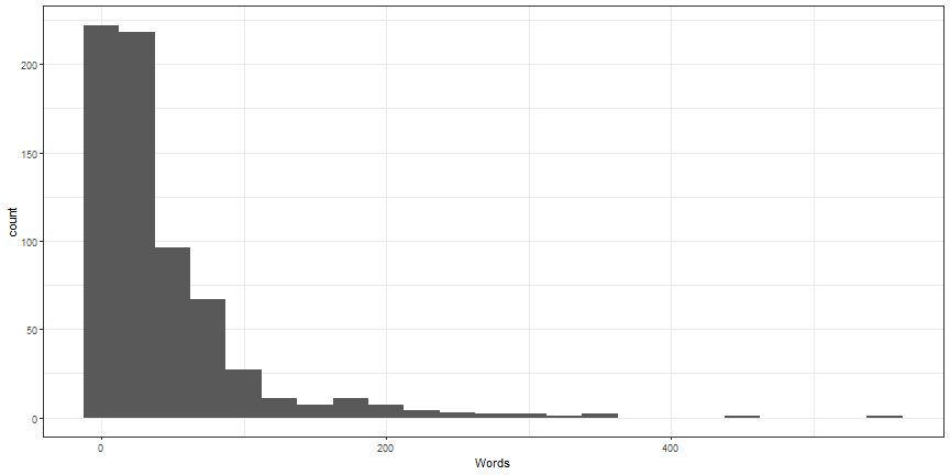
# Customize histogram
```r
ggplot(lotr, aes(x = Words)) +
geom_histogram(bins = 20) +
theme_bw()
```
# Customize histogram 2
```r
ggplot(lotr, aes(x = Words)) +
geom_histogram(binwidth = 25) +
theme_bw()
```
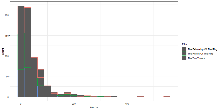
# Histograms by other variables - likely not useful
```r
ggplot(lotr, aes(x = Words, color = Film)) +
geom_histogram(binwidth = 25) +
theme_bw()
```
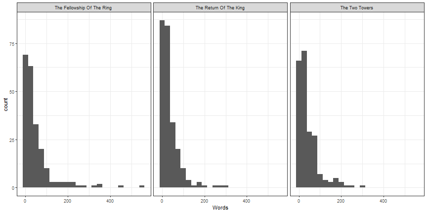
# Histograms by other variables - one alternative
```r
ggplot(lotr, aes(x = Words)) +
geom_histogram(binwidth = 25) +
theme_bw() +
facet_wrap(~ Film)
```
# Your Turn
1. With more than two groups, histograms are difficult to interpret due to overlap. Instead, use the `geom_density` to create a density plot for `Words` for each film.
2. Using `geom_boxplot`, create boxplots with `Words` as the y variable and `Film` as the x variable. Bonus: facet this plot by the variable `Race`. Bonus2: Zoom in on the bulk of the data.
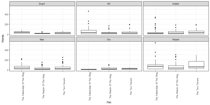
# Rotation of axis labels
```r
ggplot(lotr, aes(x = Film, y = Words)) +
geom_boxplot() +
facet_wrap(~ Race) +
theme_bw() +
theme(axis.text.x = element_text(angle = 90))
```
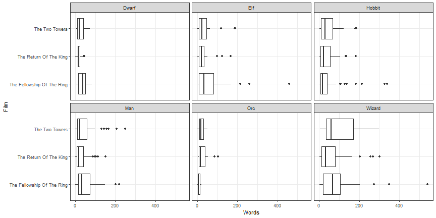
# Many times `coord_flip` is better
```r
ggplot(lotr, aes(x = Film, y = Words)) +
geom_boxplot() +
facet_wrap(~ Race) +
theme_bw() +
coord_flip()
```
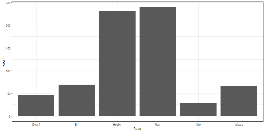
# Bar graphs
```r
ggplot(lotr, aes(x = Race)) +
geom_bar() +
theme_bw()
```
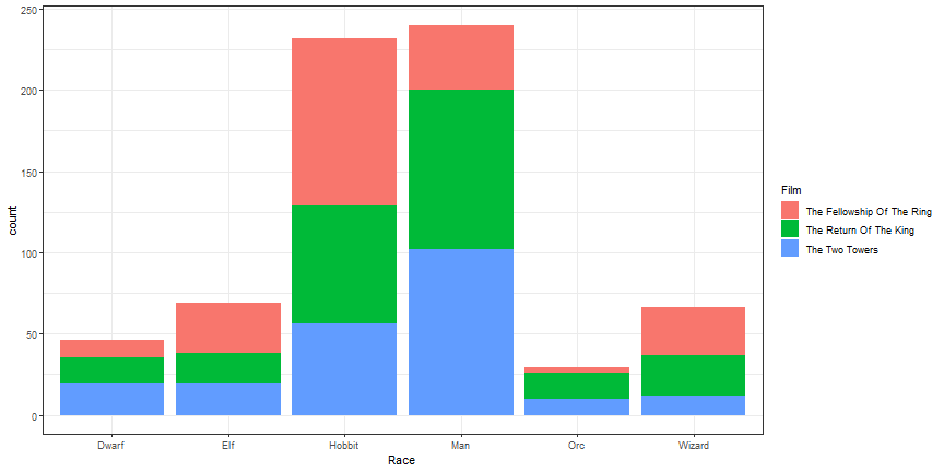
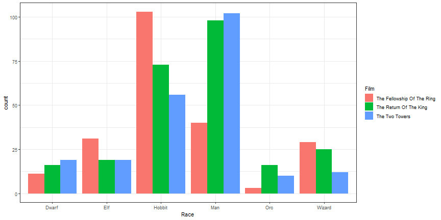
# Add aesthetic
```r
ggplot(lotr, aes(x = Race)) +
geom_bar(aes(fill = Film)) +
theme_bw()
```
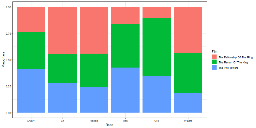
# Stacked Bars Relative
```r
ggplot(lotr, aes(x = Race)) +
geom_bar(aes(fill = Film), position = 'fill') +
theme_bw() +
ylab("Proportion")
```
# Dodged Bars
```r
ggplot(lotr, aes(x = Race)) +
geom_bar(aes(fill = Film), position = 'dodge') +
theme_bw()
```
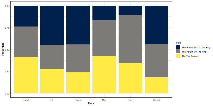
# Change Bar Col bar_coloror
```r
ggplot(lotr, aes(x = Race)) +
geom_bar(aes(fill = Film), position = 'fill') +
theme_bw() +
ylab("Proportion") +
scale_fill_viridis(option = 'cividis', discrete = TRUE)
```
# Your Turn
1. Using the gss_cat data, create a bar chart of the variable `partyid`.
2. Add the variable `marital` to the bar chart created in step 1. Do you prefer a stacked or dodged version?
3. Take steps to make one of the plots above close to publication quality.
# Additional ggplot2 resources
+ ggplot2 website: <http://docs.ggplot2.org/current/index.html>
+ ggplot2 book: <http://www.springer.com/us/book/9780387981413>
+ R graphics cookbook: <http://www.cookbook-r.com/Graphs/>
# Additional R Resources
+ R for Data Science: <http://r4ds.had.co.nz/>
# Moving to Interactive Graphics
* Why interactive graphics?
+ Created specifically for the web.
+ Can focus, explore, zoom, or remove data at will.
+ Allows users to customize their experience.
+ It is fun!
# Interactive graphics with plotly
```r
install.packages("plotly")
```
# First Interactive Plot
```r
library(plotly)
p <- ggplot(data = midwest) +
geom_point(mapping = aes(x = popdensity, y = percollege))
print(ggplotly(p))
```
# Customized Interactive Plot
```r
p <- ggplot(midwest,
aes(x = popdensity, y = percollege, color = state)) +
geom_point() +
scale_x_continuous("Population Density",
breaks = seq(0, 80000, 20000)) +
scale_y_continuous("Percent College Graduates") +
scale_color_discrete("State") +
theme_bw()
print(ggplotly(p))
```
# Your Turn
1. Using the `starwars` data, create a static ggplot and use the `ggplotly` function to turn it interactive.
# Lord of the Rings Data
- Data from Jenny Bryan: <https://github.com/jennybc/lotr>
```r
lotr <- read_tsv('https://raw.githubusercontent.com/jennybc/lotr/master/lotr_clean.tsv')
```
```
## Parsed with column specification:
## cols(
## Film = col_character(),
## Chapter = col_character(),
## Character = col_character(),
## Race = col_character(),
## Words = col_integer()
## )
```
```r
lotr
```
```
## # A tibble: 682 x 5
## Film Chapter Character Race Words
## <chr> <chr> <chr> <chr> <int>
## 1 The Fellowship Of The Ring 01: Prologue Bilbo Hobb~ 4
## 2 The Fellowship Of The Ring 01: Prologue Elrond Elf 5
## 3 The Fellowship Of The Ring 01: Prologue Galadriel Elf 460
## 4 The Fellowship Of The Ring 02: Concerning Hobbits Bilbo Hobb~ 214
## 5 The Fellowship Of The Ring 03: The Shire Bilbo Hobb~ 70
## 6 The Fellowship Of The Ring 03: The Shire Frodo Hobb~ 128
## 7 The Fellowship Of The Ring 03: The Shire Gandalf Wiza~ 197
## 8 The Fellowship Of The Ring 03: The Shire Hobbit K~ Hobb~ 10
## 9 The Fellowship Of The Ring 03: The Shire Hobbits Hobb~ 12
## 10 The Fellowship Of The Ring 04: Very Old Friends Bilbo Hobb~ 339
## # ... with 672 more rows
```
# Create plotly by hand
```r
plot_ly(lotr, x = ~Words) %>% add_histogram() %>% print()
```
# Subplots
```r
one_plot <- function(d) {
plot_ly(d, x = ~Words) %>%
add_histogram() %>%
add_annotations(
~unique(Film), x = 0.5, y = 1,
xref = "paper", yref = "paper", showarrow = FALSE
)
}
lotr %>%
split(.$Film) %>%
lapply(one_plot) %>%
subplot(nrows = 1, shareX = TRUE, titleX = FALSE) %>%
hide_legend() %>% print()
```
# Grouped bar plot
```r
plot_ly(lotr, x = ~Race, color = ~Film) %>% add_histogram() %>% print()
```
# Plot of proportions
```r
# number of diamonds by cut and clarity (n)
lotr_count <- count(lotr, Race, Film)
# number of diamonds by cut (nn)
lotr_prop <- left_join(lotr_count, count(lotr_count, Race, wt = n))
lotr_prop %>%
mutate(prop = n / nn) %>%
plot_ly(x = ~Race, y = ~prop, color = ~Film) %>%
add_bars() %>%
layout(barmode = "stack") %>% print()
```
# Your Turn
1. Using the `gss_cat` data, create a histrogram for the `tvhours` variable.
2. Using the `gss_cat` data, create a bar chart showing the `partyid` variable by the `marital` status.
# Scatterplots by Hand
```r
plot_ly(midwest, x = ~popdensity, y = ~percollege) %>%
add_markers() %>% print()
```
# Change symbol
```r
plot_ly(midwest, x = ~popdensity, y = ~percollege) %>%
add_markers(symbol = ~state) %>% print()
```
# Change color
```r
plot_ly(midwest, x = ~popdensity, y = ~percollege) %>%
add_markers(color = ~state, colors = viridis::viridis(5)) %>% print()
```
# Line Graph
```r
storms_yearly <- storms %>%
group_by(year) %>%
summarise(num = length(unique(name)))
plot_ly(storms_yearly, x = ~year, y = ~num) %>%
add_lines() %>% print()
```
# Your Turn
1. Using the `gss_cat` data, create a scatterplot showing the `age` and `tvhours` variables.
2. Compute the average time spent watching tv by year and marital status. Then, plot the average time spent watching tv by year and marital status.
# Highcharter; Highcharts for R
```r
devtools::install_github("jbkunst/highcharter")
```
# `hchart` function
```r
library(highcharter)
lotr_count <- lotr %>%
count(Film, Race)
hchart(lotr_count, "column", hcaes(x = Race, y = n, group = Film)) %>% print()
```
# A second `hchart`
```r
hchart(midwest, "scatter", hcaes(x = popdensity, y = percollege, group = state)) %>% print()
```
# Histogram
```r
hchart(lotr$Words) %>% print()
```
# Your Turn
1. Using the `hchart` function, create a bar chart or histogram with the `gss_cat` data.
2. Using the `hchart` function, create a scatterplot with the `gss_cat` data.
# Build Highcharts from scratch
```r
hc <- highchart() %>%
hc_xAxis(categories = lotr_count$Race) %>%
hc_add_series(name = 'The Fellowship Of The Ring',
data = filter(lotr_count, Film == 'The Fellowship Of The Ring')$n) %>%
hc_add_series(name = 'The Two Towers',
data = filter(lotr_count, Film == 'The Two Towers')$n) %>%
hc_add_series(name = 'The Return Of The King',
data = filter(lotr_count, Film == 'The Return Of The King')$n)
hc %>% print()
```
# Change Chart type
```r
hc <- hc %>%
hc_chart(type = 'column')
hc %>% print()
```
# Change Colors
```r
hc <- hc %>%
hc_colors(substr(viridis(3), 0, 7))
hc %>% print()
```
# Modify Axes
```r
hc <- hc %>%
hc_xAxis(title = list(text = "Race")) %>%
hc_yAxis(title = list(text = "Number of Words Spoken"),
showLastLabel = FALSE)
hc %>% print()
```
# Add title, subtitle, move legend
```r
hc <- hc %>%
hc_title(text = 'Number of Words Spoken in Lord of the Rings Films',
align = 'left') %>%
hc_subtitle(text = 'Broken down by <i>Film</i> and <b>Race</b>',
align = 'left') %>%
hc_legend(align = 'right', verticalAlign = 'top', layout = 'vertical',
x = 0, y = 80) %>%
hc_exporting(enabled = TRUE)
hc %>% print()
```
# Your Turn
1. Build up a plot from scratch, getting the figure close to publication quality using the `gss_cat` data.
# Correlation Matrices
```r
select(storms, wind, pressure, ts_diameter, hu_diameter) %>%
cor(use = "pairwise.complete.obs") %>%
hchart() %>% print()
```
# Leaflet Example
```r
library(leaflet)
storms %>%
filter(name %in% c('Ike', 'Katrina'), year > 2000) %>%
leaflet() %>%
addTiles() %>%
addCircles(lng = ~long, lat = ~lat, popup = ~name, weight = 1,
radius = ~wind*1000) %>% print()
```
# gganimate
```{r gganimate, eval = FALSE}
install.packages("gganimate")
```
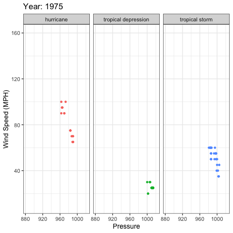
# gganimate example
```r
library(gganimate)
ggplot(storms, aes(x = pressure, y = wind, color = status)) +
geom_point(show.legend = FALSE) +
xlab("Pressure") +
ylab("Wind Speed (MPH)") +
facet_wrap(~status) +
theme_bw(base_size = 14) +
labs(title = 'Year: {frame_time}') +
transition_time(as.integer(year)) +
ease_aes('linear')
```
# gganimate output
# Additional Resources
* plotly for R book: <https://plotly-book.cpsievert.me/>
* plotly: <https://plot.ly/>
* highcharter: <http://jkunst.com/highcharter/index.html>
* highcharts: <https://www.highcharts.com/>
* htmlwidgets: <https://www.htmlwidgets.org/>
* gganimate: <https://gganimate.com/>