Visualizing highest degree by degree field (TidyTuesday!)
Python
Tidy Tuesday
Visualization
Author
Brandon LeBeau
Published
October 28, 2025
This week Tidy Tuesday data are about British Literary Prizes from 1990 to 2022. When looking at the data attributes, I was curious about the degrees that the award winners obtained and which field they were in. To keep things simple, I filter to only include Bachelor, Master, or Doctorate degrees and also remove those that have unknown degree fields. Let’s take a quick look at the data and visualize how educational background varies among fiction prize winners.
Code
import pandas as pdimport seaborn as snsimport matplotlib.pyplot as pltprizes = pd.read_csv('https://raw.githubusercontent.com/rfordatascience/tidytuesday/main/data/2025/2025-10-28/prizes.csv')wanted = ['Bachelors', 'Masters', 'Doctorate']prizes_degree = prizes[prizes['highest_degree'].isin(wanted)]prizes_degree_fiction = prizes_degree[ (prizes_degree['prize_genre'] =='fiction') & (prizes_degree['degree_field_category'] !='unknown') ]
Compute Crosstab with proportions
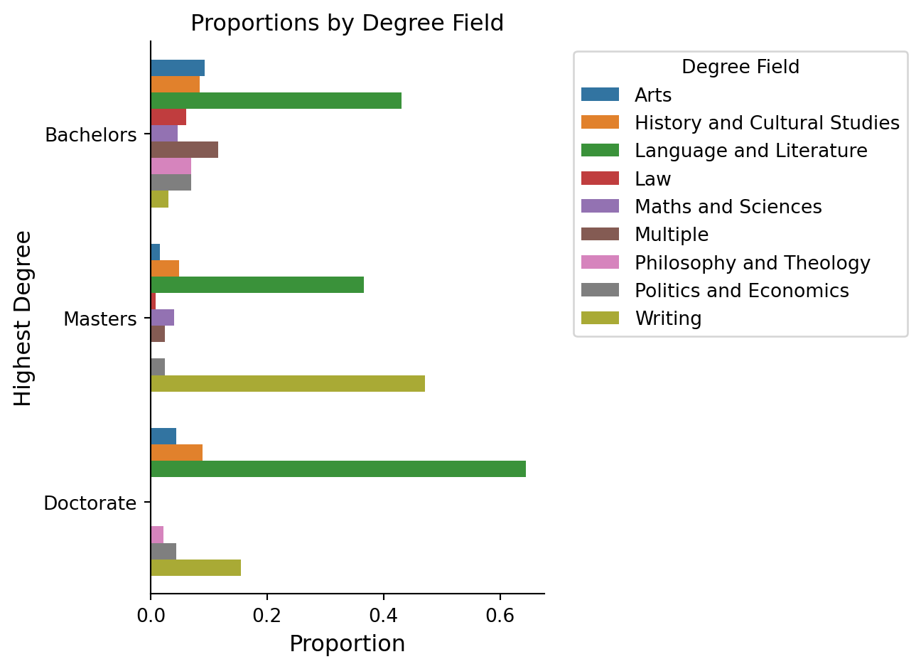
Next, I calculated the proportion of each degree field within each highest degree category. For example, what proportion of fiction prize winners who obtained a Bachelors degree graduated with an arts degree or a law degree. I computed the proportion within each degree category as I was interested in making comparisons across the different levels of degree. This helps explore whether the distribution of degree fields differs across educational levels.
I have always enjoyed using Seaborn when working in Python, I took the same approach here. I’m going to use the barplot function to put the highest degree obtained on the y-axis and the proportions computed in the previous cell on the x-axis. I like to put categorical predictors on the y-axis as I find it easier to read the axis labels. Then, I use the hue argument to show the different degree fields for these British fiction prize winners. I also explicitly set the order of the y-axis categories so that they are displayed from a Bachelor degree up to the Doctorate degree.
As you can see from the figure, there is much more diversity in the degree types for the prize winners who had a Bachelor degree as their highest degree. Language and Literature is the highest for Doctorate and Bachelor degree, but an explicit writing degree is very low for those with Bachelor degrees. This option is highest for those who obtained a Masters degree, suggesting that this was a choice to build off their Bachelor degree. This pattern could reflect how undergraduate study is often broader, while postgraduate study becomes more focused on literary analysis or creative writing.
Code
plt.figure(figsize=(7,5))ax = sns.barplot(y='highest_degree', x='prop', hue='degree_field_category', order=["Bachelors", "Masters", "Doctorate"], data=long_ct_fiction )plt.title('Proportions by Degree Field')# Remove duplicate legends and move the remaining one to the sidehandles, labels = ax.get_legend_handles_labels()by_label =dict(zip(labels, handles))ax.set_ylabel("Highest Degree", size =12)ax.set_xlabel("Proportion", size =12)ax.legend(by_label.values(), by_label.keys(), bbox_to_anchor=(1.05, 1), loc='upper left', title='Degree Field')sns.despine()plt.tight_layout()plt.show()