A recent hobby of mine (as with many other R users) is to play around with the relatively new R package: shiny. I started creating demo applications about a year ago just to figure out how powerful the platform could be, but it was not until this fall that I started creating some applications for others to use.
I encountered a problem this fall at the University of Arkansas due to the huge Java exploit going public. As a result of this, Java was blocked on all of the computers in the classrooms that I used for my intro statistics courses. Most days this does not impact my lectures, however on a few days throughout the semester I use applets to help show certain concepts.
Enter my solution, create shiny applications that attempts to mimic many of the same features found in the Java applets using shiny. The application I’ve been working on lately is an application that allows users to estimate the correlation based on a scatterplot of data.
You can run the shiny application from my github page using the following commands (make sure you have the shiny package installed first:
shiny::runGitHub(repo = "shinyApps", username = "lebebr01", subdir = "guessCorr")This should open a session in your browser that should look like the following:
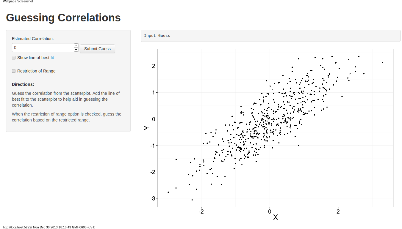
As you can see from this screenshot, there is a scatterplot in the main window and the user inputs a guess into the text box. When they hit the ‘Submit Guess’ button, the grey panel above the scatterplot updates to give hints about the direction the actual correlation is compared to the guess. Once the user is within .05 (.05 above or below) the actual correlation, the actual correlation is printed in the top text box.
The app also includes the ability to restrict the range of the scatterplot. This can be seen in the image below (and can be done on the app by clicking the ‘Restriction of Range’ checkbox):
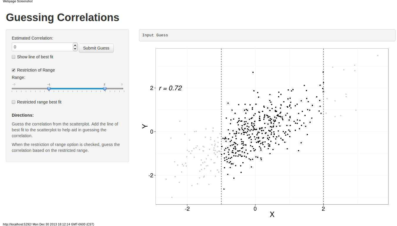
When that checkbox is clicked, a new slider shows up that restricts the range of the original scatterplot. The data that lies outside of the restricted range shows up as a light grey in the updated graph. Now the user attempts to guess the correlation for the restricted range data. The correlation for the entire data can be seen in the graph.
The one thing I was unable to implement was a second button that allows the user to click it to refresh the data to guess at another correlation. The ‘Submit Button’ in shiny is too cumbersome and I could not get two ‘Action Buttons’ to work side by side, although this may be possible. Lastly, adding the option for a counter as an indication of how well the user is doing could make it an interesting contest in the classroom.