I often see graphs that are poorly implemented in that they do not achieve their goal. One such type of graph that I see are dodged bar charts. Here is an example of a dodged bar chart summarizing the number of all star players by team (focusing specifically on the AL central division) and year from the Lahman r package:
library(Lahman)
library(dplyr)
library(ggplot2)
library(RColorBrewer)

AllstarFull$selected <- 1

numAS <- AllstarFull  %>%
  filter(yearID > 2006, lgID == 'AL', teamID %in% c('MIN', 'CLE', 'DET', 'CHA', 'KCA')) %>%
  group_by(teamID, yearID) %>%
  summarise(number = sum(selected))

b <- ggplot(numAS, aes(x = teamID, y = number, fill = factor(yearID))) + theme_bw()
b + geom_bar(stat = "identity", position = "dodge") +
scale_fill_brewer("Year", palette = "Dark2") 
Note: If you are curious from the above graph, there appears to be two typos in the teamIDs, where CHA should be CHW (Chicago White Sox) and KCA should be KCR (Kansas City Royals).
The plot above can be good for a few things, predominantly for comparison within a team. It is more difficult to compare between teams (although not impossible). One way to possibly improve the plot would be to add the number either above each bar or inside of each bar. This can be done in ggplot2 with the geom_text function. For example:
b <- ggplot(numAS, aes(x = teamID, y = number, fill = factor(yearID))) + theme_bw()
b + geom_bar(stat = "identity", position = "dodge") +
  scale_fill_brewer("Year", palette = "Dark2") +
  geom_text(aes(label = number), position = position_dodge(width = 0.9),
            vjust = 1.5)
## Warning in RColorBrewer::brewer.pal(n, pal): n too large, allowed maximum for palette Dark2 is 8
## Returning the palette you asked for with that many colors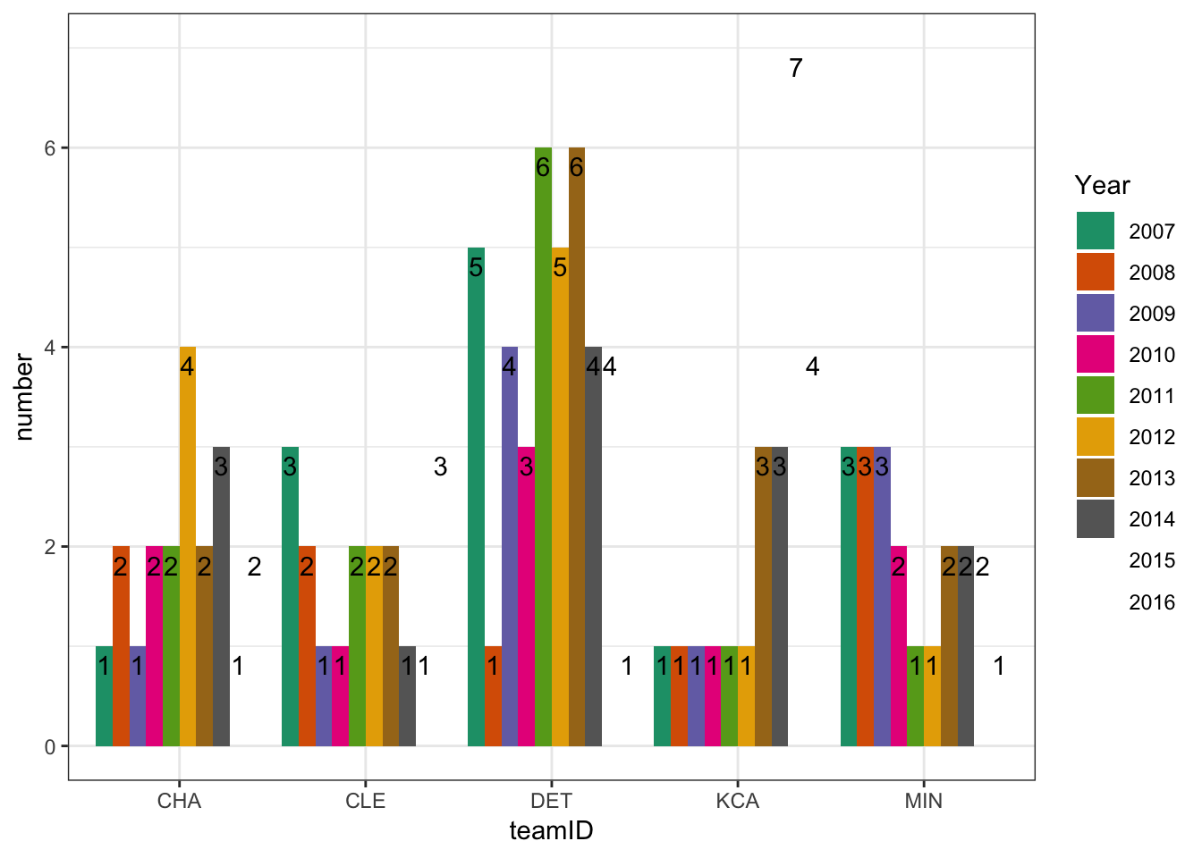
A better alternative to a dodged bar chart in my opinion would be a simple line graph. The line graph simplifies the graph to only include one variable on the x-axis and uses colors or shapes to differentiate the teams. See below.
l <- ggplot(numAS, aes(x = yearID, y = number, color = teamID, shape = teamID))
l + geom_point(size = 4) + geom_line(size = 1) +
  scale_y_continuous(limits = c(0, 7), expand = c(0,0)) +
  scale_color_brewer("Team", palette = "Dark2") + scale_shape_discrete("Team") +
  xlab("Year") + theme_bw()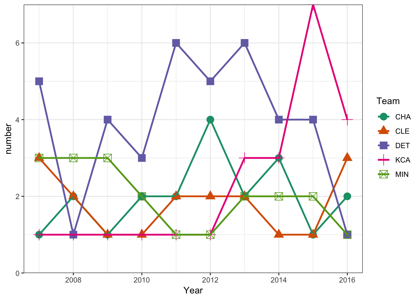
This presentation makes it much easier to compare teams within a single year and also see how the teams have changed over time. In my opinion this is a much simpler graphic and usually is a better option to serve the purpose for the graphic. As always though, the best graphic is one that conveys the message in the simplest, easiest to understand form. As always, you could improve this by making it interactive with rCharts. You could see my post on rCharts here and here.