For the past few years (quickly approaching a decade), a colleague and I started scraping information about college football coaches to explore the question, which coach should the University of Minnesota hire. This project started, as most interesting project do, at happy hour one day debating who should be hired to replace Tim Brewster, the latest college football coaching disaster at the University of Minnesota. We decided to collect some data to explore the idea in more detail.
Fast forward about 8 years and we have gathered a fair amount of college football data going back to the 19th century. We have prepared a few presentations using the data (https://brandonlebeau.org/slides/2016-07-31-jsm2016/ and https://brandonlebeau.org/slides/2015-12-04-centraliowaruser/) and are currently working on a new manuscript. Hope to share more on that soon.
In addition to these topics, I’ve been fiddling with hierarchical cluster analysis for another project and wanted to try it on the college football data to try and get a better handle on all the details. Below is a cluster analysis based on some of our data.
Hierarchical clustering ELO ratings of college football coaches
For the paper we are exploring, we computed ELO ratings for college football coaches. This is more commonly done on teams instead of coaches, but we are more interested in the coach level compared to the team level. Admittedly, there are some coach/team pairs that would be identical for the two, but many coaches move around a bit and the two need not be the same.
The following bit of code reads the ELO rating data and some coach information from a GitHub repository. Then these two data frames are merged together, the data are filtered to only include ratings since 2010, and missing data is omitted. Cluster analysis works best without missing data, therefore this is a simple way to achieve no missing data.
library(tidyverse)
library(readr)
library(forcats)
library(cluster)
library(dendextend)
library(colorspace)

ELO = read_csv("https://raw.githubusercontent.com/lebebr01/sloan-2018/master/data/elo-ratings-2017-09-18.csv")
coach_info = read_csv("https://raw.githubusercontent.com/lebebr01/sloan-2018/master/data/coaches_to2015.csv")


# transform
ELO_wide <- ELO %>%
  filter(Year > 2010) %>%
  select(Coach, Year, Rating, Rank) %>%
  gather(Rating:Rank, key = 'variable', value = 'value') %>%
  unite(col = 'variable', variable, Year) %>%
  spread(variable, value) %>%
  na.omit()
This results in a total of 71 coaches that have been coaching continuously between 2011 and 2015, a total of five years. This does not mean that each coach was with the same team for these five years, rather that they have had no gaps in coaching between 2011 and 2015 (i.e. taking a year off of coaching) or are new coaches since 2011.
Then to perform the cluster analysis, I used the select function to select only the ELO Rating variables. This is passed to the daisy function from the cluster package to create a pairwise distance matrix. I chose euclidean distance for this example which represents the root sum of squares of differences, but other options are available and results may differ based on the choice of distance metric.
Lastly, I also chose the ward clustering method, primarily for simplicity. From what I’ve read this tends to be a good starting method, but others do exist that use slightly different criteria when combining clusters. Therefore others should be explored to undertsand the sensitivity of the results to a specific clustering method.
# Attempt cluster analysis
ward_clust <- ELO_wide %>%
  select(starts_with('Rating')) %>%
  daisy(metric = 'euclidean') %>%
  agnes(diss = TRUE, method = 'ward')
Once the clustering algorithm is done, visualizing this with a dendrogram. Below is an example using the dendextend package.
coach_names <- rev(levels(ELO_wide$Coach))
dend <- as.dendrogram(ward_clust)
# order the observations:
dend <- rotate(dend, 1:71)

# Color the branches based on the clusters:
dend <- color_branches(dend, k=3)

# Manually match the labels
labels_colors(dend) <-
  rainbow_hcl(3)[sort_levels_values(
    as.numeric(ELO_wide$Coach)[order.dendrogram(dend)]
  )]

# We shall add the flower type to the labels:
labels(dend) <- paste(as.character(ELO_wide$Coach)[order.dendrogram(dend)],
                      "(",labels(dend),")",
                      sep = "")
# We hang the dendrogram a bit:
dend <- hang.dendrogram(dend, hang_height=0.2)
dend <- set(dend, "labels_cex", 0.5)
# And plot:
par(mar = c(3,3,3,7))
plot(dend,
     main = "Clustered ELO data set
     (the labels give the Coach Name)",
     horiz =  TRUE,  nodePar = list(cex = .007))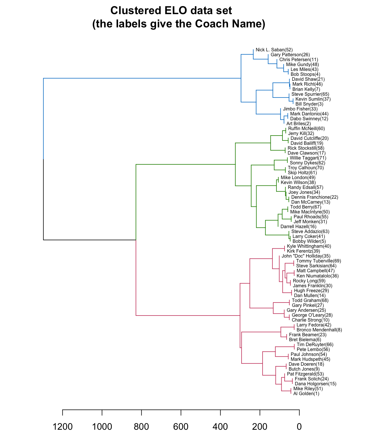
From the dendrogram, it appears from these 71 coaches, there are three groups that stand out from the rest. A further exploration of the results can be done with a heatmap. Below I create a d3 heatmap of the ELO Ratings and also include the dendrogram for the rows. The heatmap can be useful to explore similarities within the different groups. From the heatmap, it is a bit easier to see that the top cluster is the highest performing coaches, the middle cluster is the lowest performing, and the bottom cluster is an average group of coaches over this period based on ELO ratings.
d3heatmap::d3heatmap(as.matrix(select(ELO_wide, starts_with('Rating'))),
                     dendrogram = "row",
                     Rowv = dend,
                     colors = "Greens",
                     # scale = "row",
                     height = 1200,
                     show_grid = FALSE)